Hunter's Design Team - Marx Design
24/10/25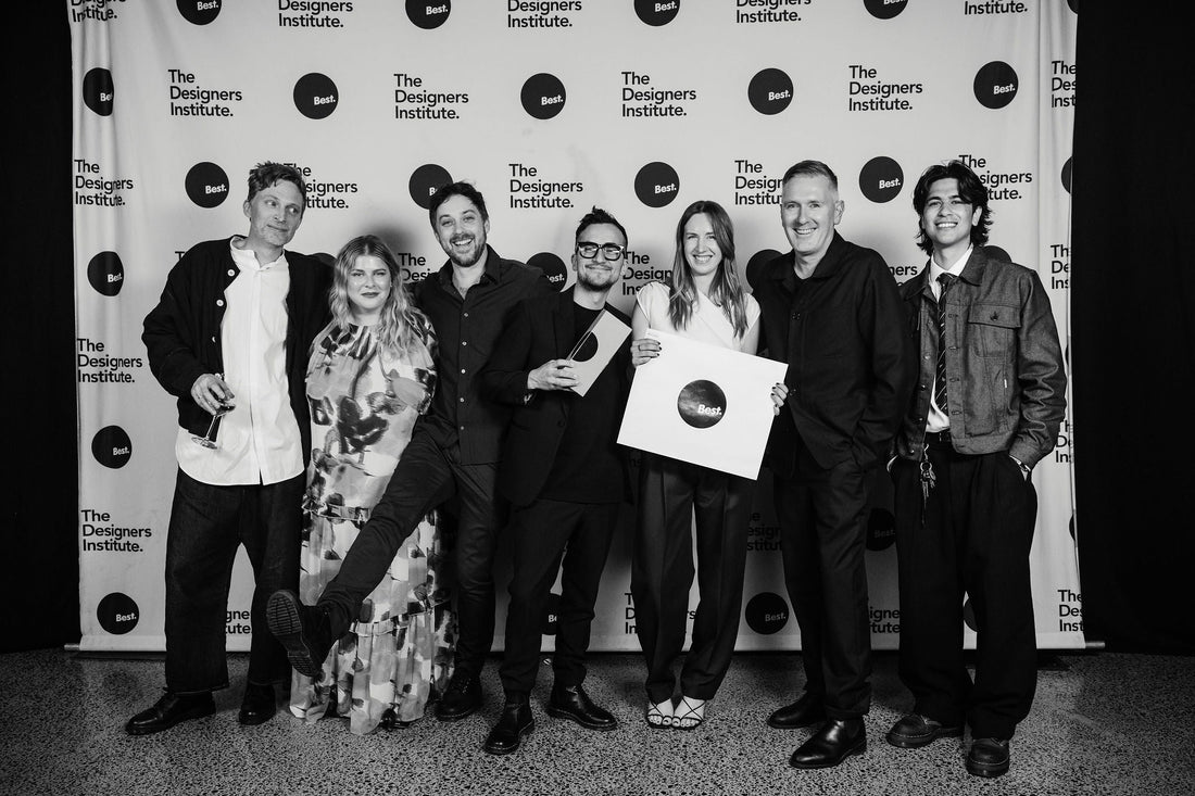
At Hunter’s, we’ve always believed that great wine deserves a great story, and how that story is shared matters just as much as how it’s made. Which is why, when it came time to refresh our brand identity for a new era, we turned to the creative minds at Marx Design.
Based in Auckland, Marx is an award-winning, progressive branding and packaging studio known for bold ideas, fresh thinking, and a knack for crafting identities that feel both timeless and current. Their work spans across industries, but always with a strong sense of story and cultural relevance.
Together, we set out to reimagine the look and feel of Hunter’s, balancing more than 40 years of heritage with a vision for the future, modern, sustainable, and ready to welcome a new generation of wine lovers.
We sat down with Ryan and Prue founders of Marx to talk about their approach, what inspired the new creative direction, and how they brought the next chapter of Hunter’s to life.
Can you tell us about your first impressions when Hunter’s approached you for a refreshed brand identity?
We were thrilled to be entrusted with a heritage brand like Hunters and allowed to bring its heritage and wonderful family story to life through the redesign. We went to Blenheim for a visit, where we were able to spend time with the family and the place, which was a great experience, and we became friends along the way.
What was the starting point for developing the creative direction? Where did you draw inspiration from?
Jane Hunter is an inspiration! Her history entwined with the future of James and Eds tenure gave us plenty to draw from. We landed at a place where we could celebrate the past and feel excited about the future – An Aspirational Legacy.
Hunter’s has such a strong heritage in New Zealand wine, both here and overseas. How did you balance honouring that history while creating something modern and fresh?
Hunters is built on a customer base that spans generations, and we held on to that. Rather than reinventing, we focused on refining and elevating, creating something timeless and elevated that would appeal to both legacy customers as well as a new audience discovering Hunters.
Were there particular design elements (colours, typography, symbols/emblems) that you felt were non-negotiable in telling the Hunter’s story?
Hunter’s has always carried a number of distinctive design elements, most notably the Hunter's crest. In collaboration with Madame Pauline Hunter, the Chief of The Hunters Clan in Scotland, we worked closely to refine this emblem. The crest was reshaped into an oval, allowing the greyhound to stand with pride and balance, creating a mark that feels elegant and a recognisable ‘seal of excellence.’ Additional line work grounds the crest in Marlborough’s rolling hills, connecting it to place. These refinements were approved and loved by The Hunters Clan – it is now with them to use as they like.

The Offshoot range, led by James and Edward, represents the next generation of Hunter’s wines. The design direction takes inspiration from the delicate tendrils of Art Nouveau botanicals, reflecting the philosophy that only the strongest roots lead to new growth. It’s a visual expression of legacy continuing to grow and move forward.
Finally, the refined wordmark is strong yet elegant, with subtle Celtic nuances that nod to heritage while looking to the future.

What part of the project are you most proud of - the moment you felt, “this is Hunter’s”?
Loads of NZ wine makers can claim they are pioneers and they often have history. But not all are still owned by the founding family that planted some of the first vines in Marlborough. For us, it was the depth of connection between the land and generations – Hunter’s is the story of Marlborough which became the tagline. It is genuine and assured.
Sustainability is at the heart of Hunter’s. How did you bring that value through in the design?
Besides the obvious choices of paper and inks, we prioritised working within the existing framework, e.g. machinery and bottles, so that the brand transition would not create waste.
How do you hope consumers feel when they see and experience the new look?
A sense of recognition and trust, along with a sense of excitement to give it a try.

If you had to describe the new Hunter’s identity in three words, what would they be?
An Aspirational Legacy.
What role do you think design plays in helping a legacy brand like Hunter’s connect with the next generation of wine drinkers?
We felt like this brand refresh was a bridge between a rich history and the future. For a legacy brand like Hunter’s, it’s not about discarding history, but reinterpreting it in ways that feel fresh and relevant to today’s wine drinkers. Thoughtful design honours the story and credibility built over decades, while introducing contemporary cues that spark curiosity and resonate with a new generation. It signals that Hunter’s is both timeless and evolving, rooted in tradition yet unafraid to grow.
Finally, how do you see the Hunter’s identity evolving in the future, is good design ever really finished?
We looked to create a robust design system that will carry the brand forward for many years to come. The new identity is crafted to feel authentic and familiar for Hunter’s loyal customers, while introducing contemporary cues needed to inspire the next generation. Good design is never truly finished but a strong system gives the brand some flexibility to grow while staying true to its roots.
QUICKFIRE QUESTIONS:
Favourite Hunter’s wine?
MiruMiru NV (Prue) Offshoot Chardonnay (Ryan)
Where do you most enjoy drinking it?
For Prue, it is getting her sisters together at their favourite Northland Beach – while all their little people play. Ryan loves a Chardonnay while cooking something delish!
What’s your go-to comfort meal (to pair with a glass of Hunter’s, of course)?
Fresh fish made into a fresh citrusy crudo with crusty bread.
Best piece of creative or life advice you’ve ever received?
This whakatauki: What is the most important thing in the world? He tangata, he tangata, he tangata. It is the people, it is the people, it is the people.
If you could share a bottle of wine with anyone, living or not, who would it be and why?
Our Grandfathers – all 4 of them! We both lost them when we were young, and as we get older, it would be amazing to spend time with these characters - sharing a great bottle/s of Hunter’s wine of course!